Enjoy Free Shipping on Orders Over $99! US Only

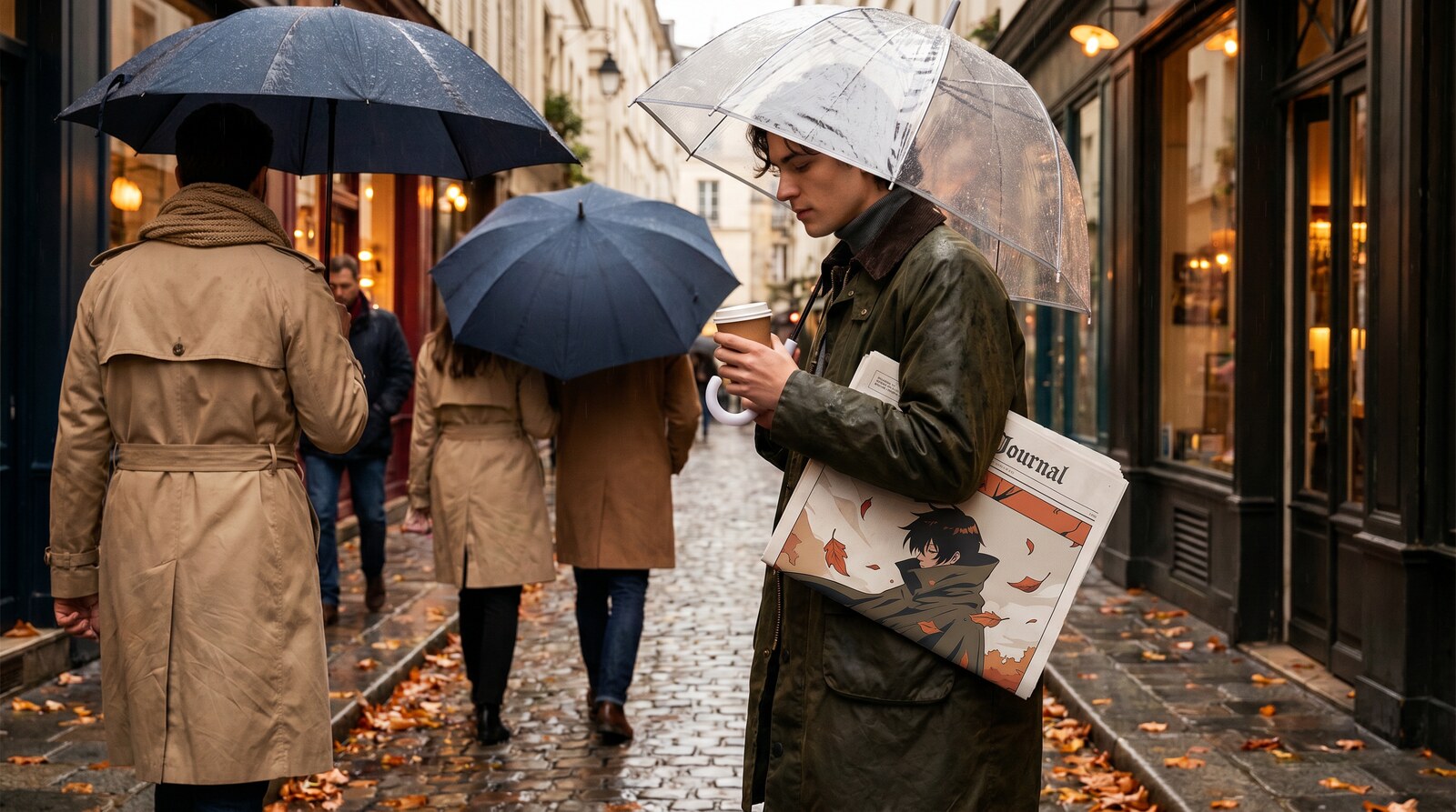
The problem with a bold anime print is not the print. It is everything you put next to it. A high saturation graphic on a black hoodie with black jeans and white sneakers is the default configuration for most of the fandom, and it works fine, and it also looks exactly like every other person wearing a graphic. Learning to wear bold anime prints against muted fall colors is the single change that moves an outfit from “has an anime hoodie on” to “dressed deliberately,” and it costs nothing because the muted half is stuff most people already own.
This is the color logic, written out properly rather than as a list of tips. Once it clicks it applies to every piece you will ever buy.
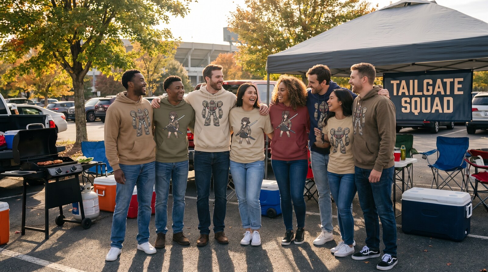
Why black is the problem, not the solution
Black is the default because it is safe, and it is safe because it does nothing. That is also the issue.
Black is not a neutral in the way people think it is. It is the highest contrast surface you can put a bright graphic on, which means the graphic reads at maximum intensity with nothing modulating it. Against black, a bright print is as loud as it can possibly be. That is occasionally what you want and usually not.
Muted colors do something black cannot: they give the eye somewhere to rest. An olive, oatmeal or rust ground lowers the overall contrast of the outfit, which paradoxically makes the graphic more readable rather than less, because it is no longer competing with a hard edge everywhere it touches.
The practical test is simple. Photograph the same shirt against black bottoms and against olive bottoms. The olive version consistently looks more expensive.
The three muted families that work in autumn
Earth: olive, khaki, rust, mustard, brown
The core autumn range and the most useful. These are warm and slightly desaturated, so they sit under almost any graphic without fighting it. Olive in particular is close to a universal solvent: it works with red graphics, blue graphics, warm graphics and cool ones.
Rust and mustard are stronger and behave more like accents than like grounds. Use them for one piece, not two.
Stone: oatmeal, cream, sand, taupe
Lighter, softer, and the most flattering in autumn light. A washed vintage sweatshirt in this range with a bolder piece elsewhere is the most reliably good looking combination in the whole guide.
The catch is practical rather than aesthetic. Light grounds mark, and autumn is mud season.
Slate: charcoal, deep green, washed indigo
Cooler and more urban. This is the range for anyone who finds earth tones too soft. Deep green especially is underused and pairs unexpectedly well with warm graphics because it is the complementary side of the wheel.
Washed indigo denim belongs in this family and is the piece almost everyone already owns.
The rule that does most of the work
Pick one color out of the print. Echo it once, somewhere small. Keep everything else muted.
That is the entire technique. If the graphic on your sweatshirt has gold in it, a mustard beanie or a tan boot picks that gold up and the outfit resolves. If it has purple in it, a slate or deep green ground gives the purple something to sit against.
What does not work is matching. Wearing a second garment in the same intensity of the same color as the print produces two things competing for the same job. Echo means a quieter version somewhere else, not a repeat.
Four combinations, concretely
Warm graphic on stone
A red or orange dominant print with oatmeal or cream bottoms and brown shoes. The warm print sits inside the warm family without disappearing, because the ground is much lighter than the graphic. Very forgiving, very autumn.
Cool graphic on earth
Blue, purple or teal print with olive or khaki bottoms. This is the complementary pairing and it is the one that looks the most considered, because the two halves are opposite rather than adjacent. A cool toned vintage hoodie over khaki is the version of this most people can build today.
Monochrome graphic on anything
Black and white prints are the easy mode of this whole discipline. With no color in the graphic there is nothing to clash, so any muted ground works and the choice becomes purely about texture and silhouette. If you are new to this, start here.
All over print with everything else silent
An all over dye sublimation print is not a graphic on a ground, it is the whole surface. There is no room to add anything. Plain bottoms, plain shoes, no second pattern, no accent. The piece is the outfit and any addition subtracts.
Texture is the part people skip
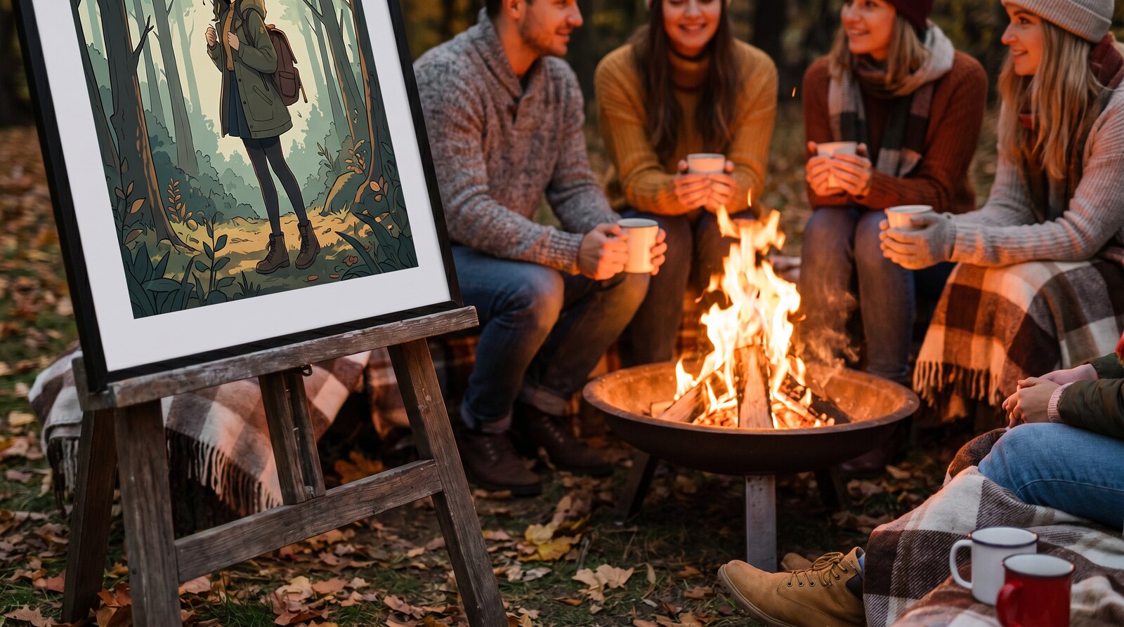
Once the colors are muted, texture becomes the thing carrying visual interest, and this is where autumn is genuinely the best season.
Fleece, corduroy, denim, knit and brushed cotton all read differently at close range while staying quiet at a distance. An outfit built from three muted pieces in three different textures does not look plain in person, even though it photographs as a calm background for the graphic.
This is also the argument for embroidered pieces in a muted palette. Stitching is texture rather than color, so it adds interest without adding a competing graphic, which makes embroidery the most flexible thing you can own if you like quiet outfits with one loud element elsewhere.
Building this for yourself
You probably do not need to buy a graphic. Most people who read this already own three or four they like and wear one at a time against black.
What is usually missing is the muted half. One pair of olive or khaki bottoms and one oatmeal layer will change every graphic you own, which is a much better return than another hoodie. Add a pair of brown or tan shoes and the wardrobe is essentially complete.
If you are buying a graphic, favor a washed print over a bright one. Washed prints are already partway toward muted, which makes them dramatically easier to place, and they read as worn in rather than new.
Buying this as a gift
If you are buying for someone who wears a lot of anime graphics, do not buy them another graphic. Buy the muted piece that makes the ones they own work better.
A plain olive or oatmeal layer, plain sweatpants, or a neutral jacket is a genuinely thoughtful gift for a person whose wardrobe is all statement pieces and no supporting cast. It is also the safer purchase, because you are not guessing which series they currently care about.
Sizing is forgiving on this kind of item. These run relaxed, so a usual size works, and a plain layer that runs slightly large is fine in a way a slightly large graphic tee is not.
Doing this for a kid
Children are the exception to most of the above, and it is worth saying plainly.
A seven year old wearing a bright graphic against bright everything looks correct. The muted discipline is an adult aesthetic and imposing it on a kid produces an outfit that looks like a small adult rather than a child who likes a show. Let the bright thing be bright.
Where the principle still helps is practical rather than visual: a muted bottom half hides mud, and the kids hoodie range in a darker ground survives a school week in a way a cream one does not.
Keeping the colors true
Muted palettes are less forgiving of fading than black is, because the whole effect depends on the relationship between tones. When one piece fades and another does not, the outfit stops resolving.
Wash inside out in cold water, skip the fabric softener, and keep everything out of a hot dryer. Softener in particular dulls color faster than washing does, and on a muted piece that dulling is exactly the change you cannot afford.
Dry olive and rust away from direct sun. Warm dyes are the ones that shift most under UV, which is why an olive jacket left on a chair by a window for a season comes back a slightly different color to the sleeve that was underneath.
A quick way to test any combination before you buy
Squint at it. Genuinely.
Squinting removes detail and leaves you with blocks of tone, which is roughly what another person sees from across a room and almost exactly what a camera records. If the outfit still reads as one loud thing against calm surroundings, it works. If it reads as several competing blocks, something has to go quiet.
This catches the most common failure, which is not a color clash at all but an intensity clash. Two pieces can be in completely different colors and still fight, because both are at the same high saturation. Squinting shows that immediately, where looking at them normally does not.
The second test is to photograph it in bad light. Phone camera, indoors, no effort. Bad light strips out the subtlety that flatters an outfit in person, so anything that survives a bad photo is genuinely well balanced rather than well lit.
What this looks like across a week
The practical shape of a wardrobe built this way is roughly four to six graphics and about the same number of muted supporting pieces, which produces far more outfits than the numbers suggest.
Each graphic works against at least three different grounds, so six graphics against four grounds is something like twenty combinations that all look deliberate. Compare that to twelve graphics and one pair of black jeans, which is twelve outfits that all look the same.
That is the argument for spending the next purchase on the quiet half rather than the loud half, and it is the thing that took me longest to accept, because buying another graphic is more fun and buying olive chinos is not. The olive chinos changed more.
One thing worth unlearning
A lot of fandom styling advice tells you to lean in harder: more graphics, brighter colors, more of the thing you like. In practice that is the fastest route to an outfit that reads as costume rather than as clothes, and it is the reason so many people quietly stop wearing pieces they spent real money on.
Muting the surroundings is the opposite instinct and it produces the opposite result. The graphic gets worn more, not less, because it now fits into a wardrobe instead of demanding a special occasion.
Frequently asked questions
What colors go with a bold anime graphic?
Muted earth tones like olive, khaki and rust; stone tones like oatmeal and cream; or slate tones like charcoal and deep green. Pick one color out of the print and echo it once somewhere small, then keep everything else quiet.
Why does black make anime prints look worse?
Black is maximum contrast, so a bright graphic on it reads at full intensity with nothing modulating it. Muted grounds lower the overall contrast, which makes the graphic more readable and the outfit look more expensive.
Can I wear two anime pieces at once?
Only if one of them has no graphic. Two prints in one outfit always compete, regardless of how well the palettes match. One loud piece plus quiet everything else is the rule that never fails.
What is the easiest way to start?
Buy one pair of olive or khaki bottoms. It changes every graphic you already own, which is a better return than buying another graphic, and it costs less.
Does this apply to all over prints too?
Not really. An all over print covers the whole garment, so there is no ground to mute and no room to add an accent. Those pieces are the entire outfit and everything else should simply get out of the way.
One closing thought
None of this is about toning your fandom down. It is the opposite. Muting everything around a graphic is what lets the graphic actually be seen, instead of being one loud thing among several. The people whose outfits you notice are almost never wearing more than you. They are wearing less, arranged better.
If you want the muted half, the sweatpants range and the vintage sweatshirt collection are where the quiet grounds live.
